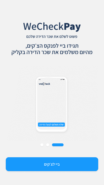
WeCheckPAY is part of a new digital payment platform we built to make the rental payment process much simpler, safer, and fully online – for both tenants and landlords.
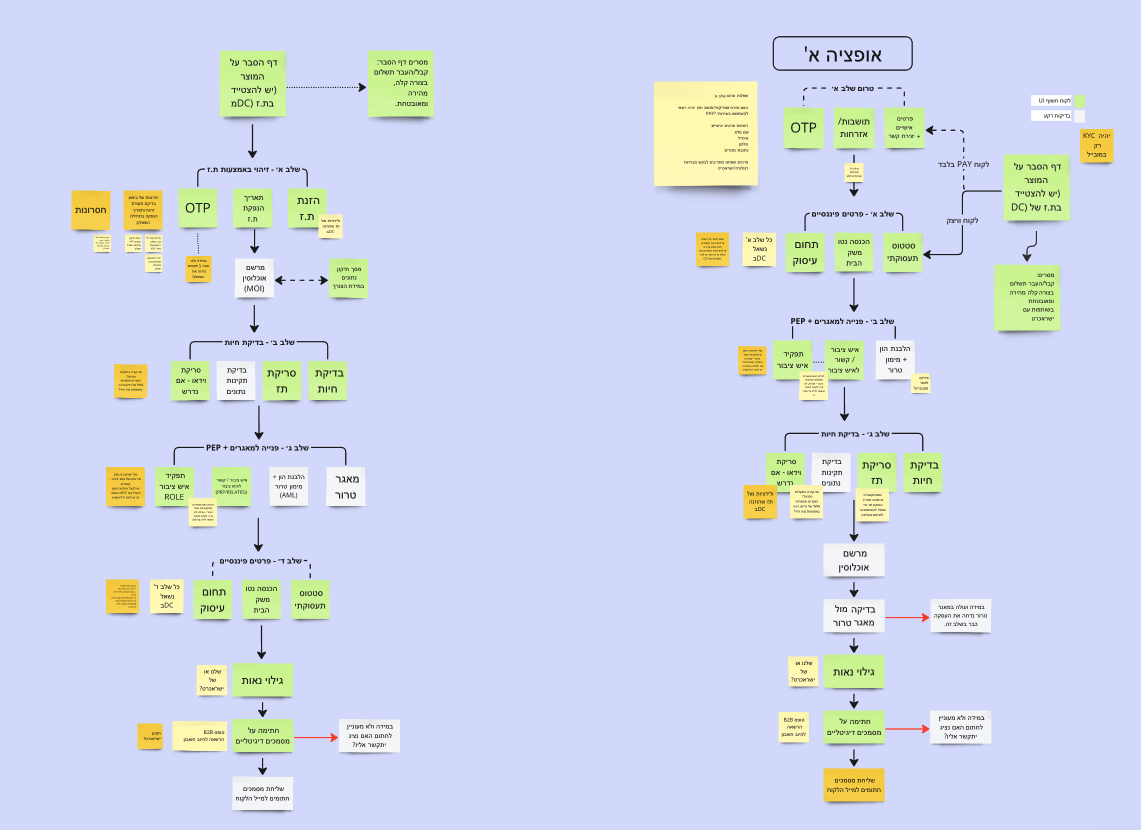
In the first phase of the product (MVP1), I was asked to lead the design of the onboarding flow – a relatively complex process involving regulatory steps, identity verification, a KYC questionnaire, and several other layers that could easily overwhelm users.
My mission was to take all that complexity and turn it into a smooth, quick, and easy-to-understand experience that users could complete on their own.
Project Goal
To design a clear and intuitive onboarding experience that hides all the regulatory complexity behind the scenes – and gives users a sense of control, confidence, and transparency.
Challenges
Meeting strict regulatory requirements without overwhelming users.
Designing a flow that works equally well for both tenants and landlords – two very different user types.
Keeping the process short, focused, and frustration-free.
Doing all of this under tight MVP constraints and deadlines.
Work Process
Deep understanding of the regulations The first step was diving into the legal requirements. I worked closely with the company’s legal advisor, breaking everything down into clear UX components and translating legal language into user-friendly flows.
Mapping the full user flow Together with product managers, I mapped every step of the process – questions, inputs, validations, edge cases, what happens if a user drops off, and what to do if documents are missing. We built clear scenarios for every possible path.
Wireframes & UX logic I translated the entire process into clear Figma wireframes, with all the right indicators, validations, and flows. The goal: guide users step-by-step and reduce friction at every turn.
Visual design + animations Once the flow was approved, I moved on to full UI design – responsive for both desktop and mobile. I created custom components and added subtle micro-animations in After Effects to make the experience feel smoother and more approachable.
Smart user testing During testing with focus groups, we noticed users were stuck on a particular field. Instead of changing the flow, I added an “info” button with a short visual explanation – and it immediately solved the issue.
Dev-ready spec document Finally, I prepared a detailed spec for the development team: every screen, state, and condition – all clearly documented with links, logic, and examples. I walked the team through it to ensure a smooth and efficient implementation.
My Role
Led the entire UX/UI process end-to-end
Coordinated between product, legal, dev, and executive stakeholders
Designed a user-centered interface without compromising on regulatory demands
Outcome
The product was launched to a pilot group, and the feedback was excellent.
Nearly all users completed the onboarding without asking for support.
We received positive feedback on how clear, smooth, and self-explanatory the process felt.
I was responsible for leading the entire UX/UI design process for the project, working closely with product managers, the legal counsel, and the development team to ensure a seamless user experience and full compliance with regulatory requirements.
A few more projects I’ve worked on
Barbershop Application
An interface for scheduling appointments and selling hair products
Personal area for a mortgage
Redesigned a personal area for mortgage customers, making key info easily accessible and reducing support calls by over 50%.
RentAI
Designed a clean, user-friendly interface for an AI-based rental pricing platform, simplifying complex real estate data under tight deadlines.